Media kit
Guidelines and assets for presenting padelracketreviews consistently: the name, the mark, the colours, the type and a screenshot you can use.
The mark is drawn in one stroke. Tap the plate to watch it again.
Who we are
What to say about us, in a sentence or in a paragraph.
padelracketreviews is the number one independent padel racket review site.
Six reviewers play every racket for weeks and score it with the same model, part science, part court time. No brand pays for a review, so the score says what we think, not what you want to hear. We match a racket to how you play, track its price, and help you stop paying for buying mistakes.
In one line. padelracketreviews tests padel rackets independently so you buy the right one for your game.
What we are not. Not a shop and not a brand's partner. No brand pays for a score or a place in a ranking. We earn a commission when a reader buys through a link, and we say so beside every Buy button.
Naming
The name is one word, written small.
Write it like this
- padelracketreviewsOne word, all lowercase, including at the start of a sentence.
- padelracketreviews.comThe address, when you need it. The name alone is enough in running text.
- Our scoreWhat we call the number out of 100. Written as "scored 93 out of 100 by padelracketreviews".
Not like this
- padelracketreviewsNot three words and not capitalised.
- PadelRacketReviewsNo capitals inside the word.
- padel-racket-reviewsNo hyphens.
- PRRWe never shorten the name, and there is no "PRR score".
The Bullpadel Vertex 05 scores 93 out of 100 on padelracketreviews, with 94 for power.When you quote a score, link to the review it comes from so a reader can check it. Scores change when we retest, so give the date if the piece will last.
Logo
The wordmark wherever there is room. The icon on its own only where the name is already in view.
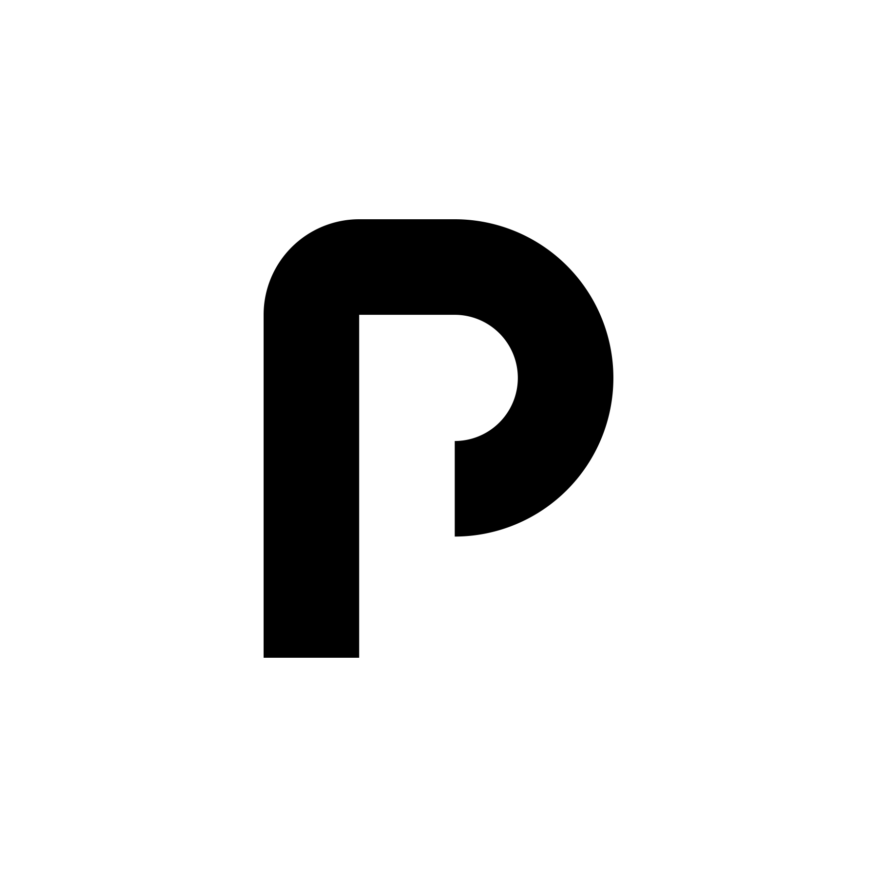
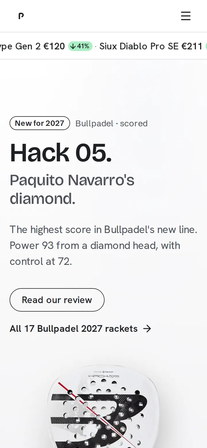
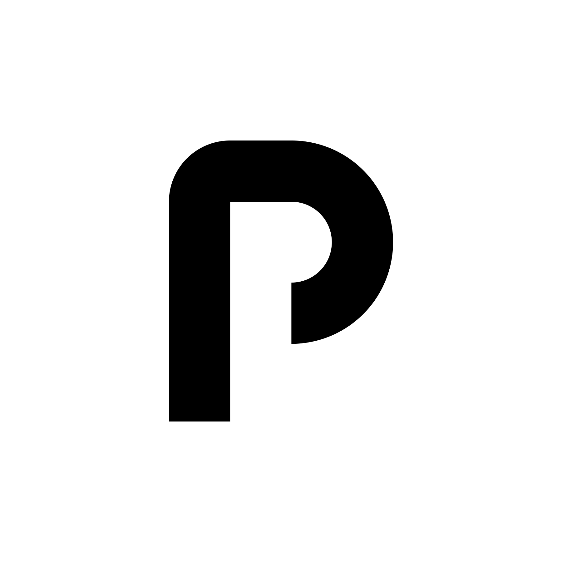
The icon is the first letter of the name, drawn in a single stroke. The bowl is left open so that you can see through it, the way you can see through our score. The name beside it is a custom setting made for the mark, not the typeface the site reads in. Use the files as they are. Do not redraw, retype, recolour, rotate or add effects.


Clear space
Keep a space around the mark at least as wide as its stem. Nothing else sits inside that space.
Minimum size
The icon stays open down to 16 pixels. The wordmark needs 120 pixels of width before the name reads.

Colour
The mark is ink on paper, white on ink, or white on the blue plate. It is never blue itself, never mint, and never a gradient.
Never
- Set the name in another typeface beside the icon.
- Close the bowl, thicken the stroke or square the corners.
- Add a shadow, an outline, a glow or a container.
- Put a racket, a ball or a court inside or behind the mark.
- Use the old court mark or any earlier logo.
The score
The second device. A number drawn open, because it opens.
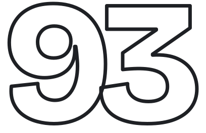
Our score is written as a hollow numeral: the display face at its heaviest weight, letters pulled tight, no fill, a thin stroke of ink. It is the one thing on a page that is drawn this way, so a reader learns that the open number is the score they can check. On the site it is live type. Where type cannot be drawn, the same digits are outlined as an image.
- Face
- Bricolage Grotesque, weight 800, tracked to minus six hundredths
- Stroke
- Three per cent of the cap height: 2 px at 68 px, 1 px at 28 px. Ink at three quarters, so it sits a step behind the words
- Label
- "Our score" beside or beneath it, in the reading face, never inside it
- As an image
- The outlined digits, for share images and email. 93.png is the sample; every score from 0 to 100 is at /brand/score/.
Motion
Two motions, the two halves of padel. A third for light.
The stroke is control: the p draws itself in one line, quickly, once. The silk is flow: a surface that moves slowly and never stops, never bounces, never repeats. Everything else on a page is still, or fades or slides once. On dark surfaces a button hovers to a light fill with a soft white glow; in light it keeps the site's hover.
The stroke
Once per visit in the nav, every time on the sign-in, and on the plate at the top of this page. Tap that plate to watch it.
The silk
On the sign-in, the homepage's brand band and a member's plate, the quiet screens. Never behind running text, never tinted, one per page. It pauses off-screen and holds one frame under reduced motion.
The glow
Dark surfaces only. Hover the button.
What never moves
- Nothing bounces. Nothing loops except the marquees and the silk.
- Cards, rows and the review's first screen are still.
- Cobalt and the silk never meet.
- Reduced motion turns all of it off.
Products
One rule for every product name.
Your shape and Your rackets are what padelracketreviews does for a player, named in plain words. A product name is never a lockup: no second symbol, no colour of its own, no different face. On the site each one sits on its plate, the icon the product uses everywhere.
Colour
Three colours, and each one means one thing.
Ink#1E2024Every word a player must trust. The score, always.
Paper#FFFFFFThe ground. Most of every page.
Blue#1A3BD6The brand. One plate, a link, a hover. Never a button across the site.
When you present us, use ink and paper. Use the blue as a plate behind the white mark when you need a brand surface. The site also uses a mint fill for one thing, a confirmed action such as Buy or a price drop. That is a product rule, not a brand colour: never use it to present us.
Typography
Two faces for the product and for presenting us. The wordmark uses neither.
Forget power.
Try it before you buy.
The Vertex 05 is a diamond racket, balanced towards the head, with a hard carbon face. On the overhead that gives you a lot of racket. Everywhere else it gives you a small sweet spot and not much help on the volley. If you already finish points at the net you will enjoy it. If you are still learning to keep the ball in, it will punish you for every late contact.
Bricolage Grotesque for headings and statements, semibold, tightHanken Grotesk for everything a player readsBoth on Google Fonts
These two faces are for presenting us in text and on screen. The wordmark is its own drawing and is never set in either of them. The voice is a coach talking to one player: literal, one qualification at a time, and an instruction at the end. No slogans, no slang.



Questions
Another format, a different size, a use you are not sure about.
Write to us through the contact page and say where the mark will appear. We answer within a few days and we can supply the files in other sizes.
If you are quoting a score in print or on air, say "padelracketreviews" in full and give the review's date.